How to Create a Responsive Web Design That Converts
A website that doesn’t look good on mobile devices is a website that is destined for failure. Nowadays, most people use their smartphones and tablets to browse the internet, so your website must look good on all devices. This blog post will discuss how to create a responsive web design that converts visitors into customers.
1. Make sure your website is mobile-friendly
The first and most crucial step in creating a responsive web design is ensuring your website is mobile-friendly. This means that your website should be designed so that it can be easily viewed on all devices, including smartphones and tablets. There are a few things you can do to make sure your website is mobile-friendly:
a) Use responsive themes or templates: If you’re using WordPress, there are plenty of responsive themes or templates available that you can use for your website. Alternatively, if you’re not using WordPress, you can find plenty of responsive HTML5 templates online that you can use for your website.
b) Use media queries: Media queries are a great way to ensure your website looks good on all devices. You can use media queries to target different screen sizes and devices and adjust the CSS accordingly.
c) Use fluid layouts: Fluid layouts are another great way to ensure that your website looks good on all devices. A fluid layout is one where the website’s width adjusts itself according to the device it’s being viewed on. This means that your website will look good on both large and small screens.
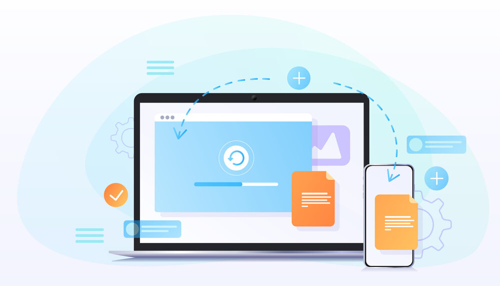
2. Use responsive images
Another critical aspect of responsive web design is using responsive images. This means you should use images sized appropriately for the device they’re being viewed on. If you use images that are too large, they will take up too much space on smaller screens and will make your website look cluttered. On the other hand, if you use images that are too small, they will appear pixelated on larger screens.
There are a few ways to ensure that your images are responsive:
a) Use the srcset attribute: The srcset attribute allows you to specify different sizes of an image for different devices. This means you can have one large image for desktop devices and a smaller one for mobile devices.
b) Use the picture element: The picture element is another way to specify different sizes of an image for different devices. With the picture element, you can also specify different sources for an image depending on the device it’s being viewed on.
c) Use responsive image breakpoints: Responsive image breakpoints are a technique that allows you to specify different sizes of an image for different devices. With responsive image breakpoints, you first decide on the optimal size of an image for a specific device, then create multiple versions of that image at different sizes. This way, you can choose the best-sized image for each device.
3. Use typography that is easy to read
One of the most important aspects of responsive web design is using typography that is easy to read. This means using large font sizes to be easily readable on all devices. It also means using font sizes that are comfortable to read on smaller screens. In addition, you should also use line height and letter spacing that are easy to read on all devices.
4. Use whitespace
Another critical aspect of responsive web design is using whitespace. Whitespace is the empty space between elements on a page. Using whitespace in your design is important because it makes your website more readable and easier to navigate. It also helps to break up the content on your pages so that visitors don’t feel overwhelmed when they’re trying to read your website.
5. Simplify your website navigation
When creating a responsive web design, it’s essential to simplify your website navigation. This means making sure that your menus and submenus are easy to understand and easy to navigate. It also means creating menus that are easy to use on smaller screens. In addition, you should also consider using a hamburger menu for your website navigation. A hamburger menu is a menu that consists of three horizontal lines. When visitors click on the hamburger menu, they can see a list of all the pages on your website.
If you need help with designing a responsive website for your business in Saudi Arabia, we at Brand Digital are readily available to assist you. Our team of experts will work with you to ensure that your website looks great on all devices and converts visitors into customers. Contact us today to learn more about our responsive web design services.

